
 |
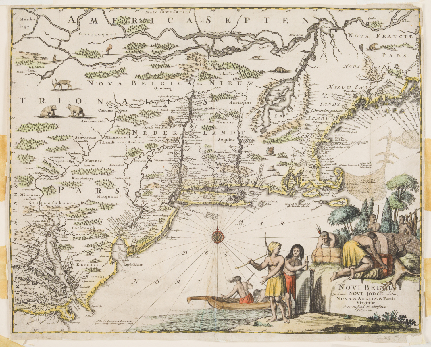
| Fig. 1. John Ogilby (Scottish, 1600–1676) and Arnoldus Montanus (Dutch, about 1625–about 1683), After Map of American Eastern Seaboard from Chesapeake Bay to Penobscot Bay, after 1670, engraving with stipple engraving and hand coloring on paper. Bequest of Robert Dudley Harrington Revocable Trust, 2017.82 |
Scottish translator and cartographer John Ogilby’s map of the North American coastline from Chesapeake Bay to Penobscot Bay (Fig. 1) is a result of an early translation of Arnoldus Montanus’ mapmaking in Amsterdam, as well as evidence of early historical cartography. Montanus’ work is considered “the first encyclopedia of the Americas.”1
Originally published in 1671 in Amsterdam, De Niewe en Onbekende Weereld: of Beschryving Van America en ‘t Zuid-Land was Montnanus’ fullest body of work, compiling maps of the entirety of North and South America, containing colonial versions of maps as well as illustrations of New York (titled “New Amsterdam”), Brazil, and portraits of early explorers and colonizers, such as Christopher Columbus. This encyclopedia, translated into English by John Ogilby, provides a window into one of the earliest informative texts on the “New World” that was disseminated throughout Europe, and then throughout the Americas.2
In addition to the portraits of colonial men, most maps feature a title cartouche—a cartographical feature with elaborate decorations which add a symbolic narrative. As seen in this map in WAM's collection, the nature of colonial map’s cartouches were often depictions of Native Americans as a kind of “proof” of the explorer’s conquest.3
Here, Native Americans in the lower corner are seen working, tending to fishing, archery, or a hunted deer. Beneath their depiction inscribes a European claim to the land, titling it “Novii Belgii” —New Belgium. Both the artistry of the cartouche and its territorial claim are evidence that a map is far more than a means of seeing locations on a piece of paper.
Ogilby’s map differs greatly from any brochure map one would use today on a road trip or hike. In the 1600s, maps were rarely used as a method to route from one place to another and were rather used as a method of cutting up the world, and laying claim to it.4; Cartography in its early stages reflected conceptually the culture where the map was made; early European maps made by Christians often situated Jerusalem at the heart of the continent.5
These symbolic maps engaged the artistry of cartographers, who occasionally commissioned an artist to help decorate the published maps. Maps, therefore, are not exclusively geographical, but are also artistic and political in their appearance, and moreover, in their interpretation.
European maps were utilized as a form of control over political and public perception in the 16th-18th centuries to sway public opinion regarding colonial expeditions. This motivation for cartographers has not been lost as mapmaking evolves, but has morphed to alter the perception of world powers in education. The distortion of maps plastered in school classrooms has been a topical debate; the Mercator projection—the most widely used map perspective in the U.S.—positions North America in the center of the map, and distorts the size of the African and Asian continents, as well as misleads its viewer on the size of the Pacific Ocean (considerably larger than the Atlantic).6
The debate of map perspective and its related impact is what led Boston Public Schools to adopt a new projection that reduces the size of European and American countries to their actual size in comparison to the rest of the world.7
Ogilby’s map reminds its viewer of the important role which all published works—art, encyclopedias, maps—play in enforcing cultural ideas and altering public perception.
—Skylar Deitch, Curatorial Intern
July 2, 2020
------------------------------------------------------------
1 D. Woodward, The Papers of the Bibliographical Society of America, 516.
2 It is important to note that at the time, maps and other materials were not nearly as widely published as they are today; only the wealthiest and elite would have had access to such texts. Matthew Edney, “Theoretical Aspects of the History of Cartography,” Theory and the History of Cartography, 48, no. 1 (1996): 188.
3 Woodward, 520.
4 Ibid., 519.
5 Edney, 192.
6 Norman Pye, “Notes on Some Problems in Presentation of Map Projections,” Geography 34, no. 2 (1949): 69.
7 Joanna Walters “Boston Public Schools Map Switch Aims to Amend 500 years of Distortion,” The Guardian, (2017): https://www.theguardian.com/education/2017/m ar/19/boston-public-schools-world-map-mercator-peters-projection?CMP=share_btn_link
https://www.theguardian.com/education/2017/m ar/19/boston-public-schools-world-map-mercator-peters-projection?CMP=share_btn_link


